This is the first tab content area.
This is the second tab content area.
This page shows a list of components, styles and other design elements that are used in the EUAA website. Please click on the side navigation to view the individual sections.
This is the official EUAA logo, which is made up of the acronyms EUAA, the complete name European Union Agency for Asylum and the designed symbol.
This is the logo to be used if it is going to appear on a dark backgrounds.
Note: Please do not distort the logo in any way. Use any of the ones presented here.
The official EUAA colours are blue and yellow as highlighted here.
These colours are used for highlights. The blue colour #1071D8 is mainly used for clickable items and links.
These colours are mainly used for backgrounds. The main website background colour is white.
Open Sans is the official typeface used for the EUAA website. Open Sans is versatile and has easy legibility characteristics.
font-family: Open Sans, sans-serif;Default website font size is 16px
Lorem ipsum dolor sit amet, consectetur adipiscing elit. Donec congue vitae quam eu mattis.
<blockquote>Lorem ipsum dolor sit amet, consectetur adipiscing elit. Donec congue vitae quam eu mattis.</blockquote><ul class="euaa-bullet-list">
<li>Lorem ipsum dolor sit amet lorem ipsum dolor sit amet lorem ipsum dolor sit amet.</li>
<li>Lorem ipsum dolor sit amet lorem ipsum dolor sit amet lorem ipsum dolor sit amet.</li>
<li>Lorem ipsum dolor sit amet lorem ipsum dolor sit amet lorem ipsum dolor sit amet.</li>
</ul>Lorem ipsum dolor sit amet lorem ipsum dolor sit amet lorem ipsum dolor sit amet.
Lorem ipsum dolor sit amet lorem ipsum dolor sit amet lorem ipsum dolor sit amet.
Lorem ipsum dolor sit amet lorem ipsum dolor sit amet lorem ipsum dolor sit amet.
<ul class="euaa-bullet-list">
    <li>
        <h3>Title here</h3>
        <p>Lorem ipsum dolor sit amet lorem ipsum dolor sit amet lorem ipsum dolor sit amet.</p>
    </li>
    <li>
        <h3>Title here</h3>
        <p>Lorem ipsum dolor sit amet lorem ipsum dolor sit amet lorem ipsum dolor sit amet.</p>
    </li>
    <li>
        <h3>Title here</h3>
        <p>Lorem ipsum dolor sit amet lorem ipsum dolor sit amet lorem ipsum dolor sit amet.</p>
    </li>
</ul>Lorem ipsum dolor sit amet lorem ipsum dolor sit amet lorem ipsum dolor sit amet.
Lorem ipsum dolor sit amet lorem ipsum dolor sit amet lorem ipsum dolor sit amet.
Lorem ipsum dolor sit amet lorem ipsum dolor sit amet lorem ipsum dolor sit amet.
<ul class="euaa-bullet-list-outline">
    <li>
        <h3>Title here</h3>
        <p>Lorem ipsum dolor sit amet lorem ipsum dolor sit amet lorem ipsum dolor sit amet.</p>
    </li>
    <li>
        <h3>Title here</h3>
        <p>Lorem ipsum dolor sit amet lorem ipsum dolor sit amet lorem ipsum dolor sit amet.</p>
    </li>
    <li>
        <h3>Title here</h3>
        <p>Lorem ipsum dolor sit amet lorem ipsum dolor sit amet lorem ipsum dolor sit amet.</p>
    </li>
</ul>This is some discreet text in a p tag
<div class="euaa-discreet-text">This is some discreet text in a div</div>
<span class="euaa-discreet-text">This is some discreet text in a span</span>
<p class="euaa-discreet-text">This is some discreet text in a p tag</p>
The facts and figures panels can be either the light blue panel or else the outline panel as seen in the panel list section
<div class="row">
    <div class="col-lg-4">
        <div class="euaa-panel euaa-panel--light-blue">
            <h3>Fact 1</h3>
            This is some text related to fact 1
        </div>
    </div>
    <div class="col-lg-4">
        <div class="euaa-panel euaa-panel--light-blue">
            <h3>Fact 2</h3>
            This is some text related to fact 2
        </div>
    </div>
    <div class="col-lg-4">
        <div class="euaa-panel euaa-panel--light-blue">
            <h3>Fact 3</h3>
            This is some text related to fact 3
        </div>
    </div>
</div><div class="row">
<div class="col-lg-3">
<div class="euaa-panel euaa-panel--light-blue">
<h3>This is a title</h3>
This is some text that sits in a light blue panel
</div>
</div>
<div class="col-lg-3">
<div class="euaa-panel euaa-panel--light-blue">
<h3>This is a title</h3>
This is some text that sits in a light blue panel
</div>
</div>
<div class="col-lg-3">
<div class="euaa-panel euaa-panel--light-blue">
<h3>This is a title</h3>
This is some text that sits in a light blue panel
</div>
</div>
<div class="col-lg-3">
<div class="euaa-panel euaa-panel--light-blue">
<h3>This is a title</h3>
This is some text that sits in a light blue panel
</div>
</div>
</div><div class="row">
<div class="col-lg-6">
<div class="euaa-panel euaa-panel--light-blue">
<h3>This is a title</h3>
This is some text that sits in a light blue panel
</div>
</div>
<div class="col-lg-6">
<div class="euaa-panel euaa-panel--light-blue">
<h3>This is a title</h3>
This is some text that sits in a light blue panel
</div>
</div>
</div>
<div class="row">
<div class="col-lg-6">
<div class="euaa-panel euaa-panel--light-blue">
<h3>This is a title</h3>
This is some text that sits in a light blue panel
</div>
</div>
<div class="col-lg-6">
<div class="euaa-panel euaa-panel--light-blue">
<h3>This is a title</h3>
This is some text that sits in a light blue panel
</div>
</div>
</div>
<figure>
    <h4>Image Title</h4>
    <img src="images/sr-1.png" />
    <figcaption>Photo Credits and source</figcaption>
</figure>This is to be used when the image or figure needs an outline.
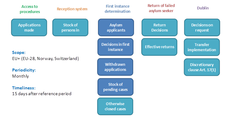
<figure class="figure-border">
    <h4>Figure Title</h4>
    <img src="images/eps-visual overview.png" />
    <figcaption>Figure 1: A figure</figcaption>
</figure>[1] EASO EPS data are preliminary and might differ from validated official statistics submitted to Eurostat at a later stage. Eurostat data are used in the annual EASO Asylum Report. The total EPS numbers include approximations for three EU+ countries and may change after data updates.
[2] For three EU+ countries, data on decisions in July were not available and the comparison with applications was adapted.
[3] For three EU+ countries, June or May values were used as July data were not available.
[4] This refers to the recognition rate for EU-regulated types of protection (refugee status and subsidiary protection) at first instance.
<div class="euaa-footnote">
    <h4>Notes</h4>
    <p>[1] EASO EPS data are preliminary and might differ from validated official statistics submitted to
    Eurostat at a later stage. Eurostat data are used in the annual EASO Asylum Report. The total EPS numbers
    include approximations for three EU+ countries and may change after data updates.</p>
    <p>[2] For three EU+ countries, data on decisions in July were not available and the comparison with
    applications was adapted.</p>
    <p>[3] For three EU+ countries, June or May values were used as July data were not available.</p>
    <p>[4] This refers to the recognition rate for EU-regulated types of protection (refugee status and
    subsidiary protection) at first instance.</p>
</div>Most of the headers used for titles are h2. There is the dark text version and white text version which is used for titles in the blue header area.
<h1>Header 1</h1>
<h2>Header 2 Dark</h2>
<div class="euaa-first-level-page-header">
    <div class="container">
        <h2>Header 2 Light</h2>
    </div>
</div>
<h3>Header 3</h3>
<h4>Header 4</h4>
<h5>Header 5</h5>
<h6>Header 6</h6>This type of paragraph is used for introductions, it is generally the first paragraph of each web page. Lorem ipsum dolor sit amet, consectetur adipiscing elit. Donec congue vitae quam eu mattis. Morbi tortor eros, iaculis id odio at, imperdiet dapibus tortor. Pellentesque a felis at lacus malesuada ornare. Donec et cursus urna. Nulla feugiat erat at sem tempor, sodales ultricies nibh ullamcorper. Pellentesque scelerisque vitae orci vel accumsan. Cras egestas commodo purus, bibendum tempor libero tristique fringilla. Nullam nec justo aliquam, pharetra nibh vitae, laoreet odio. Vestibulum tempor dui vel tellus iaculis varius.
<p class="euaa-intro-text">
    This type of paragraph is used for introductions, it is generally the first paragraph of each web page.
    Lorem ipsum dolor sit amet, consectetur adipiscing elit. Donec congue vitae quam eu mattis.
    Morbi tortor eros, iaculis id odio at, imperdiet dapibus tortor. Pellentesque a felis at lacus malesuada
    ornare. Donec et cursus urna. Nulla feugiat erat at sem tempor, sodales ultricies nibh ullamcorper.
    Pellentesque scelerisque vitae orci vel accumsan. Cras egestas commodo purus, bibendum tempor libero
    tristique fringilla. Nullam nec justo aliquam, pharetra nibh vitae, laoreet odio.
    Vestibulum tempor dui vel tellus iaculis varius.
</p>Lorem ipsum dolor sit amet, consectetur adipiscing elit. Donec congue vitae quam eu mattis. Morbi tortor eros, iaculis id odio at, imperdiet dapibus tortor. Pellentesque a felis at lacus malesuada ornare. Donec et cursus urna. Nulla feugiat erat at sem tempor, sodales ultricies nibh ullamcorper. Pellentesque scelerisque vitae orci vel accumsan. Cras egestas commodo purus, bibendum tempor libero tristique fringilla. Nullam nec justo aliquam, pharetra nibh vitae, laoreet odio. Vestibulum tempor dui vel tellus iaculis varius. This is some bold text inside a normal paragraph.
<p>
    Lorem ipsum dolor sit amet, consectetur adipiscing elit. Donec congue vitae quam eu mattis.
    Morbi tortor eros, iaculis id odio at, imperdiet dapibus tortor. Pellentesque a felis at lacus malesuada
    ornare. Donec et cursus urna. Nulla feugiat erat at sem tempor, sodales ultricies nibh ullamcorper.
    Pellentesque scelerisque vitae orci vel accumsan. Cras egestas commodo purus, bibendum tempor libero
    tristique fringilla. Nullam nec justo aliquam, pharetra nibh vitae, laoreet odio. Vestibulum tempor
    dui vel tellus iaculis varius. This is some <strong>bold text</strong> inside a normal paragraph.
</p>This is some text here written by someone. Lorem ipsum dolor sit amet, consectetur adipiscing elit. Donec congue vitae quam eu mattis.
Name of Person Job Description<div class="euaa-testimonial-box">
<p>This is some text here written by someone. Lorem ipsum dolor sit amet,
consectetur adipiscing elit. Donec congue vitae quam eu mattis.</p>
<span>Name of Person</span>
<span>Job Description</span>
</div>Open all panels
<div class="euaa-accordion">
    <div class="euaa-accordion-panel">
        <input class="euaa-accordion-panel__selector" type="checkbox" id="chck1">
        <label class="euaa-accordion-panel__label" for="chck1">Panel 1</label>
        <div class="euaa-accordion-panel__content">This is an accordion panel</div>
    </div>
    <div class="euaa-accordion-panel">
        <input class="euaa-accordion-panel__selector" type="checkbox" id="chck2">
        <label class="euaa-accordion-panel__label" for="chck2">Panel 2</label>
        <div class="euaa-accordion-panel__content">This is an accordion panel</div>
    </div>
</div>
Open one panel and close the other panels.
<div class="euaa-accordion">
    <div class="euaa-accordion-panel">
        <input class="euaa-accordion-panel__selector" type="radio" id="rac1" name="acc">
        <label class="euaa-accordion-panel__label" for="rac1">Panel 1</label>
        <div class="euaa-accordion-panel__content">This is an accordion panel</div>
    </div>
    <div class="euaa-accordion-panel">
        <input class="euaa-accordion-panel__selector" type="radio" id="rac2" name="acc">
        <label class="euaa-accordion-panel__label" for="rac2">Panel 2</label>
        <div class="euaa-accordion-panel__content">This is an accordion panel</div>
    </div>
</div>Use either a span or a div for a badge.
<div class="euaa-badge euaa-badge--primary">Primary Badge</div>
<div class="euaa-badge euaa-badge--secondary">Secondary Badge</div>
<div class="euaa-badge euaa-badge--highlight">Highlight Badge</div>
<div class="euaa-badge euaa-badge--purple">Purple Badge</div>
<div class="euaa-badge euaa-badge--pink">Pink Badge</div>
<div class="euaa-badge euaa-badge--teal">Teal Badge</div>
<div class="euaa-badge euaa-badge--error">Red Badge</div>
<div class="euaa-badge euaa-badge--success">Success Badge</div>
<div class="euaa-badge euaa-badge--outline">Outline Badge</div>
The blue highlight badge can be used for updated items, wherease the green badge should be used for success and positive messages. As can be seen fontawesome icons can be added to the text inside the badge. For more fontawesome icons click here.
Recently Updated Updated Updated on [date] New<span class="euaa-badge euaa-badge--highlight">Recently Updated</span>
<span class="euaa-badge euaa-badge--highlight">Updated</span>
<span class="euaa-badge euaa-badge--highlight">Updated on [date]</span>
<span class="euaa-badge euaa-badge--success">
<i class="fas fa-check"></i> New
</span><div>
<label class="euaa-chkbox">
<input type="checkbox" checked="checked">
<span class="euaa-chkbox__checkmark"></span>One
</label>
</div>
<div>
<label class="euaa-chkbox">
<input type="checkbox" checked="checked">
<span class="euaa-chkbox__checkmark"></span>Two
</label>
</div><div>
<label class="euaa-chkbox euaa-chkbox--disabled">
<input type="checkbox" checked="checked" disabled>
<span class="euaa-chkbox__checkmark"></span>
Checked Disabled
</label>
</div>
<div>
<label class="euaa-chkbox euaa-chkbox--disabled">
<input type="checkbox" disabled>
<span class="euaa-chkbox__checkmark"<>/span>
Disabled
</label>
</div><input class="euaa-form-element" type="text" value="text" /><input class="euaa-form-element" type="text" value="text" disabled /><input class="euaa-form-element euaa-form-element--error" type="text" value="text" /><input class="euaa-form-element" type="password" value="text" /><textarea class="euaa-form-element">This is a text area</textarea><textarea class="euaa-form-element" disabled>This is a text area</textarea><select class="euaa-form-element">
<option>Select from list</option>
<option>Option 1</option>
<option>Option 2</option>
<option>Option 3</option>
</select><div class="euaa-message-box euaa-message-box--info u-mar-b-m">
<i class="fas fa-info-circle"></i>
This is an Info message box
</div><div class="euaa-message-box euaa-message-box--success u-mar-b-m">
<i class="fas fa-check-circle"></i>
This is a Success message box
</div><div class="euaa-message-box euaa-message-box--alert u-mar-b-m">
<i class="fas fa-exclamation-triangle"></i>
This is an Alert message box
</div><div class="euaa-message-box euaa-message-box--error u-mar-b-m">
<i class="fas fa-times-circle"></i>
This is an Error message box
</div><div class="euaa-message-box euaa-message-box--outline">
This is an Outline message box
</div>These headers stretch the full width of the page.
Lorem ipsum dolor sit amet, consectetur adipiscing elit. Sed porttitor turpis at nulla tristique congue. Proin ipsum libero, imperdiet a tincidunt at, efficitur sed dolor.
<div class="euaa-first-level-page-header">
    <div class="container">
        <div class="row">
            <div class="col-md-8 col-lg-8">
                <ul class="euaa-breadcrumb">
                    <li class="euaa-breadcrumb__item"><a href="index.html">Home</a></li>
                    <li class="euaa-breadcrumb__item euaa-breadcrumb__item--current">Title 1</li>
                </ul>
                <h2>Title 1</h2>
                <p>
                Lorem ipsum dolor sit amet, consectetur adipiscing elit. Sed porttitor turpis at nulla tristique congue.
                Proin ipsum libero, imperdiet a tincidunt at, efficitur sed dolor.
                </p>
            </div>
            <div class="col-md-4 col-lg-4">
                <div class="euaa-first-level-page-header__right">
                    <button class="euaa-btn euaa-btn--primary euaa-btn--large">Call to Action Button</button>
                </div>
            </div>
        </div>
    </div>
</div><div class="euaa-second-level-page-header">
<div class="container">
<div class="row">
<div class="col-md-8 col-lg-8">
<ul class="euaa-breadcrumb">
<li class="euaa-breadcrumb__item"><a href="index.html">Home</a></li>
<li class="euaa-breadcrumb__item"><a href="#">Title 1</a></li>
<li class="euaa-breadcrumb__item euaa-breadcrumb__item--current">Title 2</li>
</ul>
<h2>Title 2</h2>
</div>
<div class="col-md-4 col-lg-4">
<div class="euaa-second-level-page-header__right">
<button class="euaa-btn euaa-btn--primary">Call to Action Button</button>
</div>
</div>
</div>
</div>
</div>These can be used full width as seen here or combined with other elements on the same horizontal axis.
<div class="euaa-panel euaa-panel--outline">
    <h3>This is a title</h3>
    This is a panel with a title, some text a <a href="#">link</a> and a button.
    <div> </div>
    <button class="euaa-btn euaa-btn--ghost">Button</button>
</div><div class="euaa-panel euaa-panel--outline">
<h3>Panel with list of items</h3>
This is a panel with a list of items.
<ul class="euaa-bullet-list">
<li>Item 1</li>
<li>Item 2</li>
<li>Item 3</li>
</ul>
</div><div class="euaa-panel euaa-panel--outline euaa-panel--icon">
<div><i class="fas fa-user"></i></div>
<div>
<h3>This is a title</h3>
<p>This is a panel with a title and some text.</p>
</div>
</div>These can be used full width or combined with other elements on the same line.
<div class="euaa-panel euaa-panel--light-blue">
    <h3>This is a title</h3>
    This is a panel with a title, some text a <a href="#">link</a> and a button.
    <div> </div>
    <button class="euaa-btn euaa-btn--ghost">Button</button>
</div><div class="euaa-panel euaa-panel--light-blue">
<h3>Panel with list of items</h3>
This is a panel with a list of items.
<ul class="euaa-bullet-list">
<li>Item 1</li>
<li>Item 2</li>
<li>Item 3</li>
</ul>
</div><div class="euaa-panel euaa-panel--light-blue euaa-panel--icon">
<div><i class="fas fa-user"></i></div>
<div>
<h3>This is a title</h3>
This is a panel with a title and some text.
</div>
</div>These can be used full width or combined with other elements on the same line.
<div class="euaa-panel euaa-panel--light-grey">
    <h3>This is a title</h3>
    This is a panel with a title, some text a <a href="#">link</a> and a button.
    <div> </div>
    <button class="euaa-btn euaa-btn--ghost">Button</button>
</div><div class="euaa-panel euaa-panel--light-grey">
<h3>Panel with list of items</h3>
This is a panel with a list of items.
<ul class="euaa-bullet-list">
<li>Item 1</li>
<li>Item 2</li>
<li>Item 3</li>
</ul>
</div><div class="euaa-panel euaa-panel--light-grey euaa-panel--icon">
<div><i class="fas fa-user"></i></div>
<div>
<h3>This is a title</h3>
This is a panel with a title and some text.
</div>
</div>Use this in conjunction with other elements on the same line.
<div class="euaa-panel euaa-panel--primary">
    <h3>This is a title</h3>
    This is a panel with a title and some text and a <a href="#">link</a>.
</div>
<div class="euaa-panel euaa-panel--primary euaa-panel--icon">
<div><i class="fas fa-user"></i></div>
<div>
<h3>This is a title</h3>
This is a panel with a title and some text.
</div>
</div><div class="euaa-panel euaa-panel--primary euaa-panel--big-number">
123
<div class="euaa-panel--small-text">Some text here</div>
</div><div class="euaa-panel-square euaa-panel--primary euaa-panel--big-number">
<div class="euaa-panel-square__box">
123
<div class="euaa-panel--small-text">some text here</div>
</div>
</div><div class="euaa-panel-square euaa-panel--primary euaa-panel--icon">
<div class="euaa-panel-square__box">
<i class="fas fa-user"></i>
<div>
<h3>This is a title</h3>
This is a panel with a title and some text.
</div>
</div>
</div>Use these panels in conjunction with other elements on the same line.
<div class="euaa-panel euaa-panel--yellow">
    <h3>This is a title</h3>
    This is a panel with a title and some text and a link.
</div>
<div class="euaa-panel euaa-panel--yellow euaa-panel--icon">
<div><i class="fas fa-user"></i></div>
<div>
<h3>This is a title</h3>
This is a panel with a title and some text.
</div>
</div><div class="euaa-panel euaa-panel--yellow euaa-panel--big-number">
123
<div class="euaa-panel--small-text">Some text here</div>
</div><div class="euaa-panel-square euaa-panel--yellow euaa-panel--big-number">
<div class="euaa-panel-square__box">
123
<div class="euaa-panel--small-text">some text here</div>
</div>
</div><div class="euaa-panel-square euaa-panel--yellow euaa-panel--icon">
<div class="euaa-panel-square__box">
<i class="fas fa-user"></i>
<div>
<h3>This is a title</h3>
This is a panel with a title and some text.
</div>
</div>
</div><div>
<label class="euaa-radiobutton">
<input type="radio" checked="checked" name="radio">
<span class="euaa-radiobutton__circle"></span>
One
</label>
</div>
<div>
<label class="euaa-radiobutton">
<input type="radio" name="radio">
<span class="euaa-radiobutton__circle"></span>
Two
</label>
</div><div>
<label class="euaa-radiobutton euaa-radiobutton--disabled">
<input type="radio" name="radio-1" checked="checked" disabled>
<span class="euaa-radiobutton__circle"></span>
Checked Disabled
</label>
</div>
<div>
<label class="euaa-radiobutton euaa-radiobutton--disabled">
<input type="radio" name="radio-1" disabled>
<span class="euaa-radiobutton__circle"></span>
Disabled
</label>
</div>This only uses CSS
Lorem ipsum dolor sit amet, consectetur adipisicing elit. Libero fuga facilis vel consectetur quos sapiente deleniti eveniet dolores tempore eos deserunt officia quis ab? Excepturi vero tempore minus beatae voluptatem! Libero fuga facilis vel consectetur quos sapiente deleniti eveniet dolores tempore eos deserunt officia quis ab? Excepturi vero tempore minus beatae voluptatem!
<div id="expand-collapse-area">
    <div>
        <input type="checkbox" class="euaa-read-more__state" id="paragraph-more" />
        <p class="euaa-read-more__wrap">
            Lorem ipsum dolor sit amet, consectetur adipisicing elit.
            <span class="euaa-read-more__target">
                Libero fuga facilis vel consectetur quos sapiente deleniti eveniet dolores tempore eos deserunt
                officia quis ab? Excepturi vero tempore minus beatae voluptatem!
                <span>Libero fuga facilis vel consectetur quos sapiente deleniti eveniet dolores tempore eos
                deserunt officia quis ab? Excepturi vero tempore minus beatae voluptatem!</span>
            </span>
            <label for="paragraph-more" class="euaa-read-more__trigger"></label>
        </p>
    </div>
</div><div class="euaa-second-level-page-content__tabs">
<!-- Tabs Section - START -->
<ul id="myTab2" role="tablist" class="nav nav-tabs euaa-tabs">
<li class="nav-item">
<a id="home2-tab" data-toggle="tab" href="#home2" role="tab" aria-controls="home2"
aria-selected="true" class="nav-link active">Tab 1</a>
</li>
<li class="nav-item">
<a id="profile2-tab" data-toggle="tab" href="#profile2" role="tab" aria-controls="profile2"
aria-selected="false" class="nav-link">Tab 2</a>
</li>
</ul>
<!-- Tabs Section - END -->
<!-- Tab Content - START -->
<div id="myTab2Content" class="euaa-tab-content tab-content">
<div id="home2" role="tabpanel" aria-labelledby="home-tab" class="tab-pane fade show active">
This is the first tab content area.
</div>
<div id="profile2" role="tabpanel" aria-labelledby="profile-tab" class="tab-pane fade">
This is the second tab content area.
</div>
</div>
<!-- Tab Content - END -->
</div><div class="euaa-filter-area">
<h3>Filter Section</h3>
<div class="row">
<div class="col-lg-3">Year
<input class="euaa-form-element" type="text" />
</div>
<div class="col-lg-3">Language
<input class="euaa-form-element" type="text" />
</div>
<div class="col-lg-3">Type
<input class="euaa-form-element" type="text" value="type" />
</div>
<div class="col-lg-3">Topic
<select class="euaa-form-element" type="text">
<option>Option 1</option>
<option>Option 2</option>
<option>Option 3</option>
</select>
</div>
</div>
<div></div>
<div class="row">
<div class="col-lg-6">Keywords
<input class="euaa-form-element euaa-form-element--full-width" type="text" />
</div>
<div class="col-lg-6">Title
<input class="euaa-form-element euaa-form-element--full-width" type="text" />
</div>
</div>
<div> </div>
<button type="button" class="euaa-btn euaa-btn--secondary">Cancel</button>
<button type="button" class="euaa-btn euaa-btn--primary">Filter</button>
</div>| Header 1 | Header 2 | Header 3 | Badge | Actions | |
|---|---|---|---|---|---|
| Cell 1 | Cell 2 | Cell 3 | Badge | Actions | |
| Cell 1 | Cell 2 | Cell 3 | Badge | Actions | |
| Cell 1 | Cell 2 | Cell 3 | Badge | Actions | |
| Cell 1 | Cell 2 | Cell 3 | Badge | Actions |
<table class="euaa-responsive-table">
    <thead>
        <tr>
            <th>
                <span>
                    <label class="euaa-chkbox">
                        <input type="checkbox">
                        <span class="euaa-chkbox__checkmark"></span>
                    </label>
                </span>
            </th>
            <th>Header 1</th>
            <th>Header 2</th>
            <th>Header 3</th>
            <th>Badge</th>
            <th>Actions</th>
        </tr>
    </thead>
    <tbody>
        <tr class="euaa-responsive-table__row--bg-animation">
            <td>
                <span>
                    <label class="euaa-chkbox">
                        <input type="checkbox">
                        <span class="euaa-chkbox__checkmark"></span>
                    </label>
                </span>
            </td>
            <td>Cell 1</td>
            <td>Cell 2</td>
            <td>Cell 3</td>
            <td>
                <span class="euaa-badge euaa-badge--primary">Badge</span>
            </td>
            <td>
                <a href="#">Actions</a>
            </td>
        </tr>
        <tr class="euaa-responsive-table__row--bg-animation">
            <td>
                <span>
                    <label class="euaa-chkbox">
                        <input type="checkbox">
                        <span class="euaa-chkbox__checkmark"></span>
                    </label>
                </span>
            </td>
            <td>Cell 1</td>
            <td>Cell 2</td>
            <td>Cell 3</td>
            <td>
                <span class="euaa-badge euaa-badge--primary">Badge</span>
            </td>
            <td>
                <span><a href="#">Actions</a></span>
            </td>
        </tr>
        <tr class="euaa-responsive-table__row--bg-animation">
            <td>
                <span>
                    <label class="euaa-chkbox">
                        <input type="checkbox">
                        <span class="euaa-chkbox__checkmark"></span>
                    </label>
                </span>
            </td>
            <td>Cell 1</td>
            <td>Cell 2</td>
            <td>Cell 3</td>
            <td>
                <span class="euaa-badge euaa-badge--primary">Badge</span>
            </td>
            <td>
                <a href="#">Actions</a>
            </td>
        </tr>
        <tr class="euaa-responsive-table__row--bg-animation">
            <td>
                <span>
                    <label class="euaa-chkbox">
                        <input type="checkbox">
                        <span class="euaa-chkbox__checkmark"></span>
                    </label>
                </span>
            </td>
            <td>Cell 1</td>
            <td>Cell 2</td>
            <td>Cell 3</td>
            <td>
                <span class="euaa-badge euaa-badge--primary">Badge</span>
            </td>
            <td>
                <a href="#">Actions</a>
            </td>
        </tr>
    </tbody>
</table>| Header 1 | Header 2 | Language | Badge | Actions | |
|---|---|---|---|---|---|
| Cell 1 | Cell 2 | Badge | Actions | ||
| Cell 1 | Cell 2 | Badge | Actions | ||
| Cell 1 | Cell 2 | Badge | Actions | ||
| Cell 1 | Cell 2 | Badge | Actions |
<table class="euaa-responsive-table euaa-responsive-table--alternating">
    <thead>
        <tr>
            <th>
                <span>
                    <label class="euaa-chkbox">
                        <input type="checkbox">
                        <span class="euaa-chkbox__checkmark"></span>
                    </label>
                </span>
            </th>
            <th>Header 1</th>
            <th>Header 2</th>
            <th>Language</th>
            <th>Badge</th>
            <th>Actions</th>
        </tr>
    </thead>
    <tbody>
        <tr class="euaa-responsive-table__row--bg-animation">
            <td>
                <span>
                    <label class="euaa-chkbox">
                        <input type="checkbox">
                        <span class="euaa-chkbox__checkmark"></span>
                    </label>
                </span>
            </td>
            <td>Cell 1</td>
            <td>Cell 2</td>
            <td>
                <button class="euaa-btn euaa-btn--ghost euaa-btn--mini mr-2">EN</button>
                <button class="euaa-btn euaa-btn--ghost euaa-btn--mini">MT</button>
            </td>
            <td>
                <span class="euaa-badge euaa-badge--primary">Badge</span>
            </td>
            <td>
                <a href="#">Actions</a>
            </td>
        </tr>
     </tbody>
</table>| Header 1 | Header 2 | Header 3 | Badge | Actions | |
|---|---|---|---|---|---|
| Cell 1 | Cell 2 | Cell 3 | Badge | Actions | |
| Cell 1 | Cell 2 | Cell 3 | Badge | Actions | |
| Cell 1 | Cell 2 | Cell 3 | Badge | Actions | |
| Cell 1 | Cell 2 | Cell 3 | Badge | Actions |
<table class="euaa-responsive-table euaa-responsive-table--dark-title">
    <thead>
        <tr>
            <th>
                <span>
                    <label class="euaa-chkbox">
                        <input type="checkbox">
                        <span class="euaa-chkbox__checkmark"></span>
                    </label>
                </span>
            </th>
            <th>Header 1</th>
            <th>Header 2</th>
            <th>Header 3</th>
            <th>Badge</th>
            <th>Actions</th>
        </tr>
    </thead>
    <tbody>
        <tr>
            <td>
                <span>
                    <label class="euaa-chkbox">
                        <input type="checkbox">
                        <span class="euaa-chkbox__checkmark"></span>
                    </label>
                </span>
            </td>
            <td>Cell 1</td>
            <td>Cell 2</td>
            <td>Cell 3</td>
            <td>
                <span class="euaa-badge euaa-badge--primary">Badge</span>
            </td>
            <td>
                <a href="#">Actions</a>
            </td>
        </tr>
    </tbody>
</table>These are icons that can be found in the media gallery and can be included when adding content in the website.
There are 2 sizes available: 90px by 90px and 48px by 48px
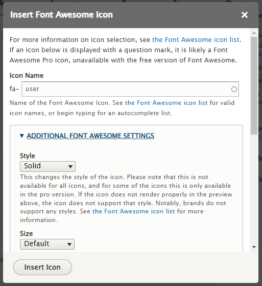
In the content editing section, you can select Fontawesome icons.
These can be found by clicking on the flag icon  . You can then select the
icon that you want to use by typing the name of the icon in the 'Icon Name' field.
. You can then select the
icon that you want to use by typing the name of the icon in the 'Icon Name' field.
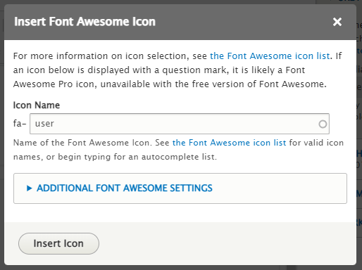
For the following set of fontawesome icons type any of these names, then click on 'Additional Font Awesome Settings' and from the 'Style'' drop down options select "Regular".
These icons are reserved specifically for First Level Pages


Content can be added inside one of these grid options.
Various icons can be added to enhance the content within the website. For icon usage please refer to the icons section.
These various panels should be added inside one of the grid panels shown above.
When adding an image, always make sure to add an image panel and then add the image that you would like to add from the Media library.
[Add Content Here]
[Add Content Here]
[Add Content Here]
[Add Content Here]
[Add Content Here]
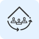
This role card should be used with the Grid - 2 in a row setup and not take the full width of the page.
The following are some classes that can be added to the code to improve the layout.
This is based on Bootstrap code
A class in the following naming convention can be added for padding or margins
{property}{sides}-{size}
where property is:
where sides is one of these
where size is one of these
An example of this is mt-3 which sets the margin top.
For text alignment use the following classes:
You can use the following classes to set these widths:
You can use the following classes to set these heights:

Social Media